After 10 years the brand preeflow® by ViscoTec shines in new brilliance
Because of the 10th anniversary, which preeflow® celebrated in March 2018, the brand for microdosing now appears with a new logo.
The new brand identity symbolizes the change from an initially small ViscoTec department to an internationally known brand in the field of dosing liquids in small and very small quantities. But what is the new branding?
The imagery combines everything that preeflow® stands for
Innovative, harmonious, simple – these values are linked in the new logo. However, the message behind the brand remains the same. The newly developed logo, in which the two “e” merge endlessly, stands for the endless piston principle on which all preeflow® and ViscoTec products are based. The “e” continues to carry the following message:
- easy dosing technology
- easy handling, easy dispensing
- exact, precise dosing
- effective dosing
- economic
The logo was developed on the model of the Chinese sign Yin and Yang to illustrate the harmony between the preeflow®-Team and the customer.
“Away from the Wave”
The lettering has also changed a lot. Not only the “wave” has been eliminated, but the colours and font have also been adapted and have a much more modern and appealing design.
The smooth crossover of the constant arranged letters radiates harmony and symbolises good and high-quality workmanship as well as innovative technology and perfect function. The simple and clear structures of the new logo are also reflected in dealings with the customers. This is the top priority for both, preeflow® and ViscoTec – we want to offer clarity and easy handling.
The colour design of the preeflow® logo was adapted to that of the ViscoTec logo. The new blue not only expresses a certain affiliation of the brand to the company, in combination with black the colouring and the colour ratio of the preeflow dispensers are also reflected in the logo. Black stands for seriousness and blue illustrates innovative technology. The thicker typeface conveys trust and firmness the customer.
All these elements contribute to preeflow®’s unique brand image and distinguish preeflow® from all other companies in the industry in the global market. However, the new logo is only the first step towards redesigning the entire corporate design which is gradually being completed and perfected.
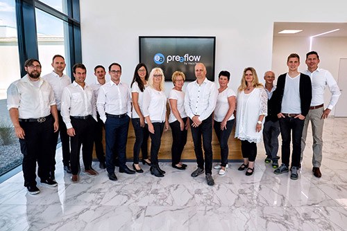
preeflow® is currently staffed with 14 team members – from business development, sales and dealer support to installation, the ViscoTec business area of preeflow® operates completely independently. For years, preeflow® has been growing continuously as well on the market and as in the team. All microdispensers, which are available from stock, are sold exclusively through an international dealer network. This guarantees proximity to the customer.


